Explore innovative Fintech website designs for a seamless user experience. Discover user-friendly platforms that redefine financial technology excellence.
The Fintech industry is experiencing unprecedented growth, with innovative startups and established companies continually pushing the boundaries of financial technology. As a fintech entrepreneur, you understand the critical role that a well-designed website plays in attracting and retaining users.
In this article, we delve into the realm of fintech website designs, presenting you with a curated list of exceptional examples to inspire your next financial venture.
Table of Contents
What Sets Fintech Websites Apart?
Modern and Fresh Designs:
In the ever-evolving fintech realm, innovation is the driving force. Fintech companies leverage modern and fresh website designs to convey their commitment to pushing boundaries. Sleek layouts and cutting-edge aesthetics become the visual representation of their forward-thinking approach.
User-Friendly Interfaces:
Unlike traditional B2B-focused financial services, many fintech products cater to consumers directly. Hence, user-friendly interfaces are paramount. Explore how intuitive navigation and clear calls-to-action enhance the overall user experience, making financial services accessible to a broader audience.
Responsive and Mobile-Friendly:
With fintech products being accessed on the go, website responsiveness is non-negotiable. Dive into the importance of mobile-friendly designs, ensuring seamless user experiences across various devices. Discover how adaptive designs contribute to the success of fintech ventures.
The List of 40 Best Fintech Website Designs Inspiration
1. Betterment:
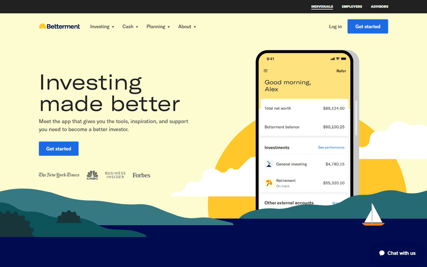
Betterment kicks off our exploration of fintech websites with a modern mix of bright solid colors, custom graphics, and seamless interactivity. The website stands out in a niche industry with its vibrant design elements and an overall user-friendly experience.
2. Stripe:
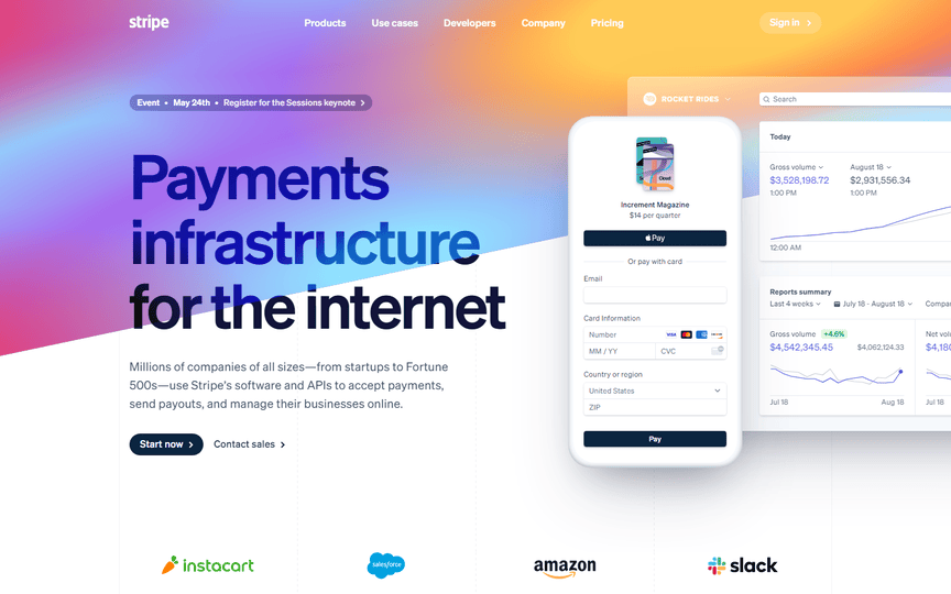
Stripe consistently earns its place on lists of beautiful website designs. The homepage boasts dynamic elements, bright colors, and meticulous attention to detail, showcasing the prowess of its web development team.
3. Mint:
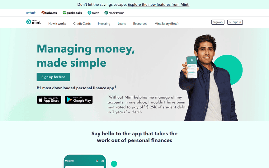
Mint embraces the challenge of using green in a fun and appealing way. The website’s design incorporates splashes of graphics and images, enhancing the overall aesthetics. The inclusion of a resources area with the latest fintech news adds value to the user experience.
4. Nerdwallet:
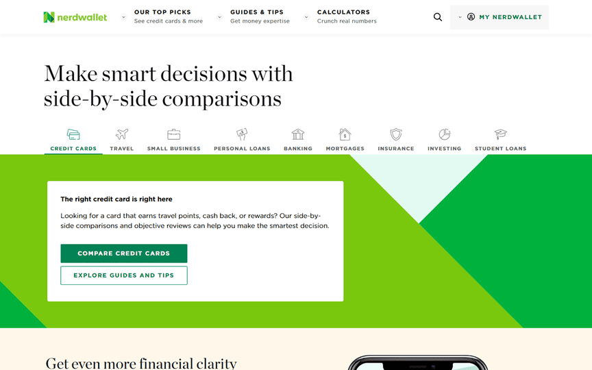
Nerdwallet’s ultra-modern website serves as a versatile tool for both nerds and finance professionals. Each section is meticulously designed, providing a pleasing user experience that combines functionality and aesthetics.
5. Robinhood:
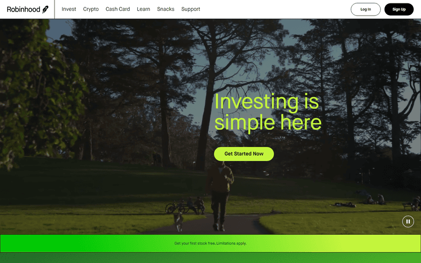
Robinhood, a popular financial technology website, features an out-of-the-box design that captivates designers with its innovative approach. Stellar colors and a seamless scrolling experience make it a standout. The “learn” section enriches users with valuable insights into financial markets.
6. PayIt:
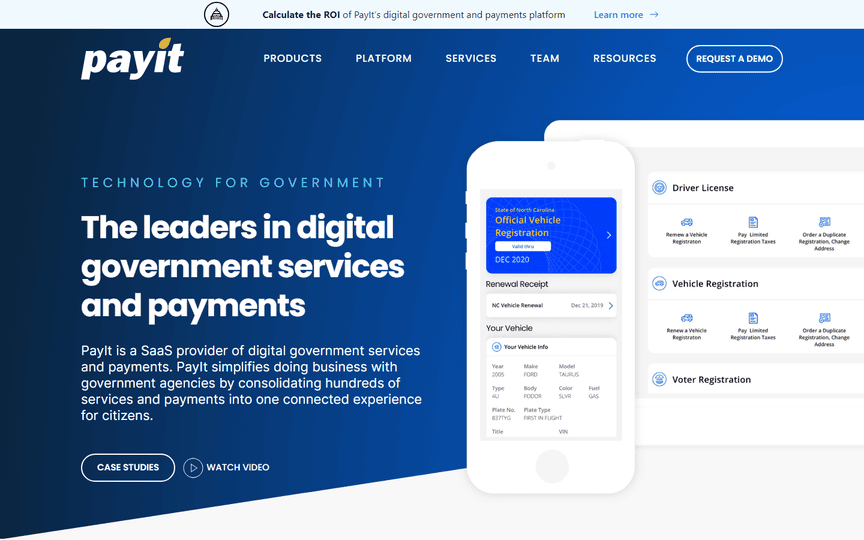
PayIt stands out as the most informative yet visually pleasing payment technology website on the list. The professional feel, color palette, and content presentation contribute to an exceptional user experience.
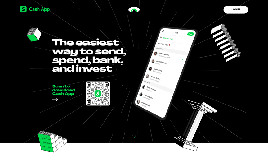
7. Cash App:
Cash App claims the title of the coolest financial technology website, boasting unique graphics and animations that add a touch of crime-investigation flair to the site.
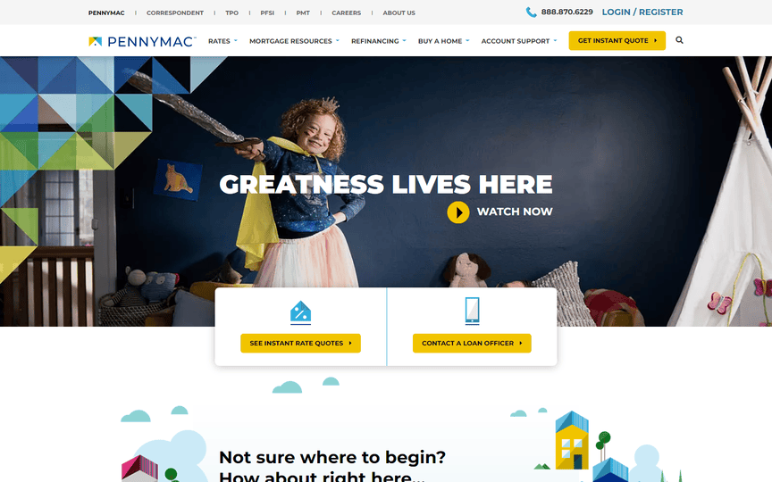
8. Pennymac:
Pennymac stands out with original vector graphics that inject colors and fun into the overall design. Quick and easy calls-to-action further enhance user engagement and boost conversions.
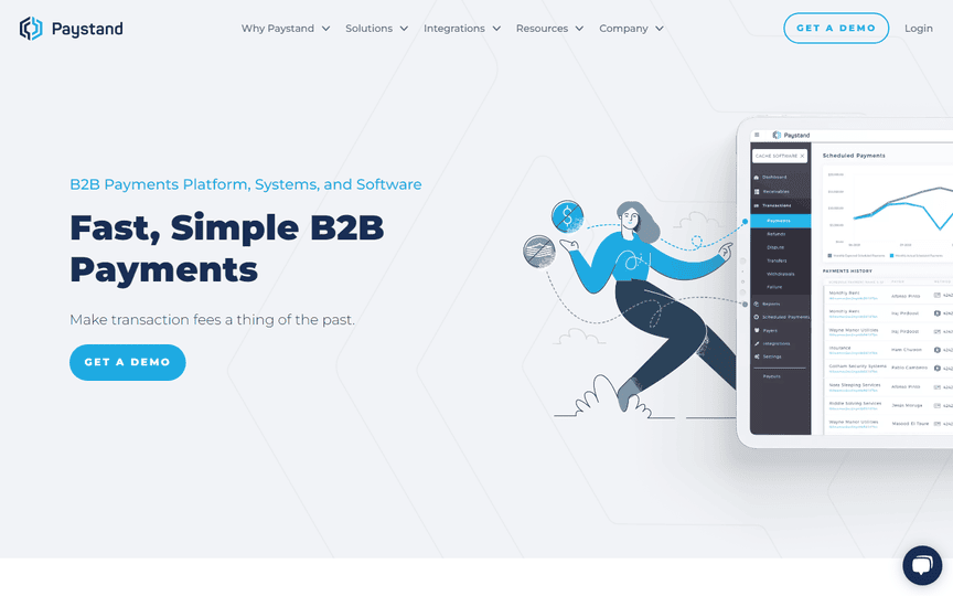
9. Paystand:
Paystand earns admiration for its standout mega menu and pleasing animations and interactions. The resources page becomes a treasure trove for fintech enthusiasts, offering blogs, research reports, and articles.
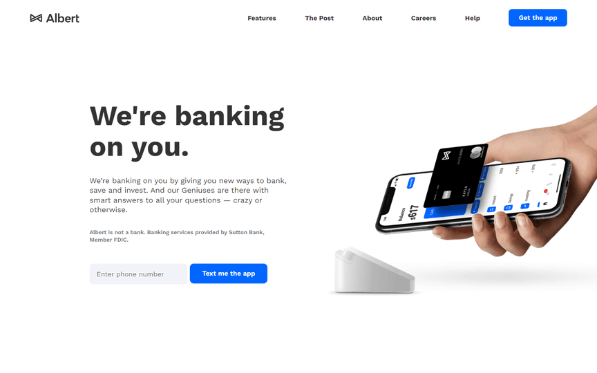
10. Albert:
Albert’s website boasts one of the cleanest designs, featuring ample white space that literalizes the term ‘whitespace.’ The spritely blue accent adds excitement to the financial products the company offers.
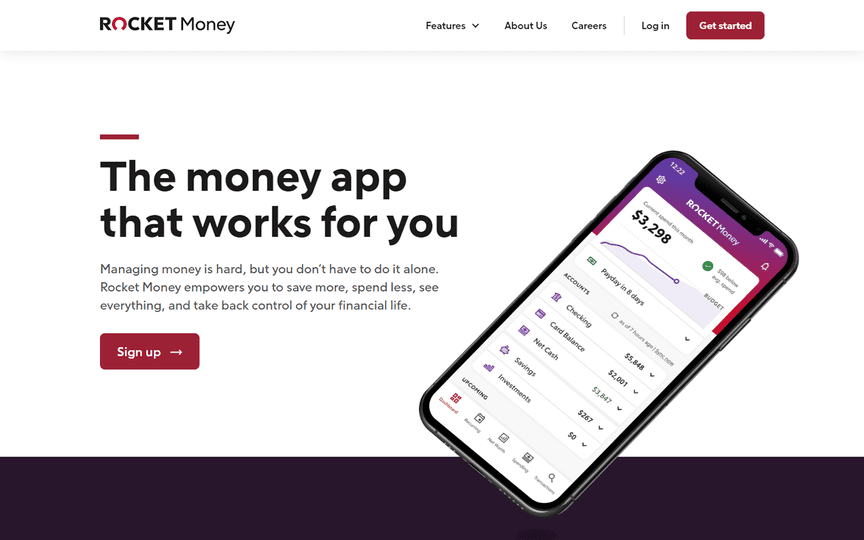
11. Rocket:
Rocket impresses with modern and catchy graphics, organized navigation, clear buttons, interactive elements, and a row of 5-star reviews enhancing the brand’s credentials.
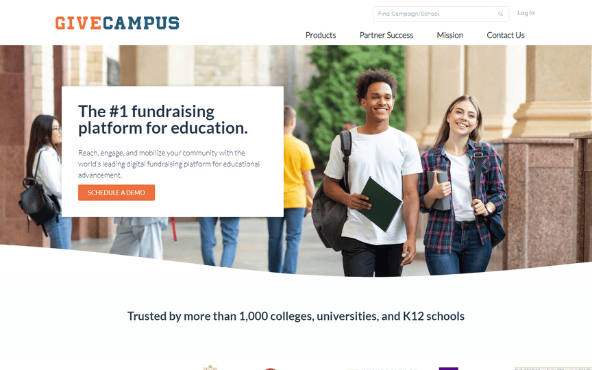
12. GiveCampus:
GiveCampus offers an airy and clean website, straightforwardly showcasing a comprehensive range of services. The inclusion of logos from assisted schools adds a personal touch to the presentation.
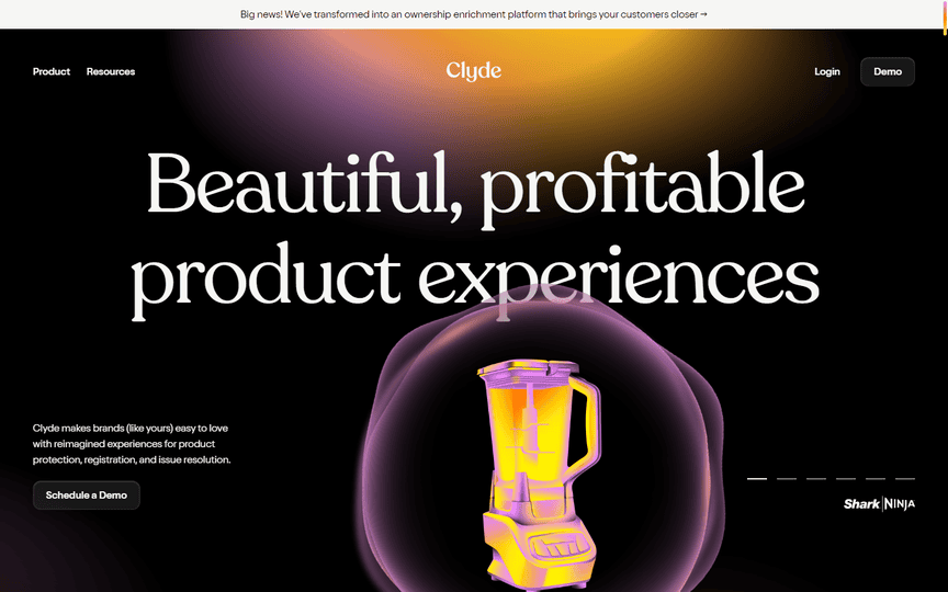
13. Clyde:
Clyde emerges as a powerful business website, showcasing greatly coded effects and functions. The resources page becomes a hub for fintech blogs and content that aids in both learning and financial decision-making.
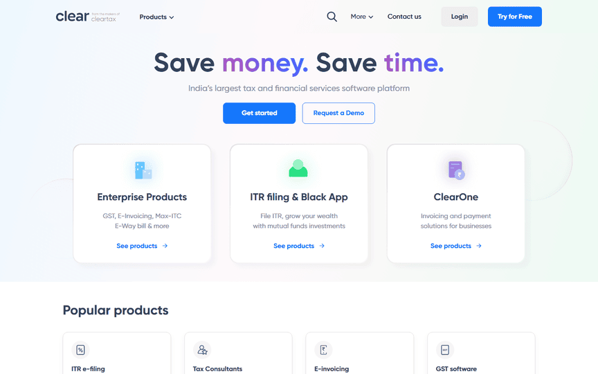
14. Clear:
Clear’s website exemplifies how gradients can be implemented successfully in a financial services design. Organizing business tools and products into cards enhances user comprehension.
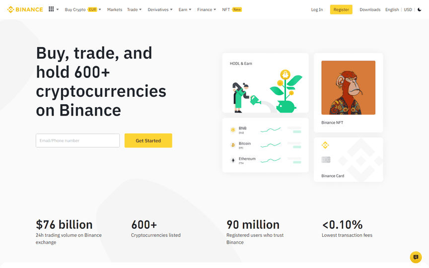
15. Binance:
Binance, one of the most popular on the list, boasts clean, stark, and sleek design elements. The website harmoniously integrates all its elements, offering low fees on transactions and staying abreast of global banking innovations.
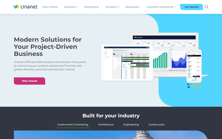
16. Unanet: Intuitive Experience and Promising Functionality
Unanet captivates users with its intuitive experience, featuring a variety of shapes that elegantly divide sections. The website’s design is both interesting and functional, promising a seamless experience for end-users. The informative fintech blogs keep visitors abreast of the latest in the banking sector.
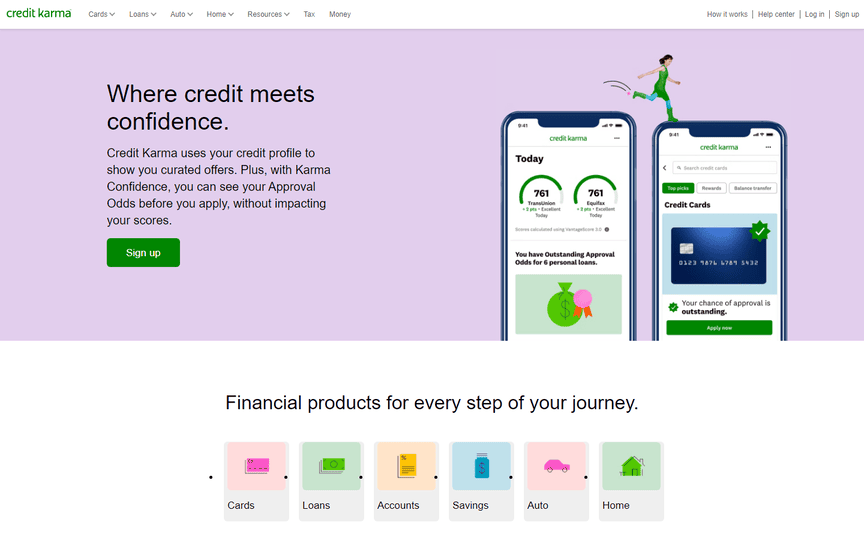
17. Credit Karma: Unique Color Palette and Subtle Graphics
Credit Karma stands out with its use of less saturated pastel colors against contrasting black fonts, creating a unique visual appeal. Subtle and cute graphics enhance the overall design, while the financial news and blogs provide in-depth analyses of digital banking and financial markets.
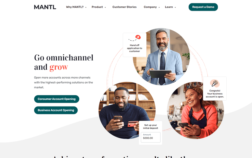
18. Mantl: Elegant, Sophisticated, and Catchy
Mantl exudes elegance and sophistication with a catchy design. Despite numerous graphics and animations, the site maintains a light and simple feel, resonating well with the global fintech community. Customer stories add credibility to the diverse range of financial services offered.
19. Brick: Information-Heavy Yet Well-Contained
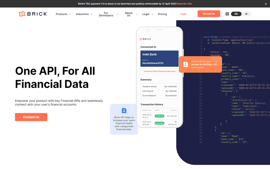
Brick’s website is information-heavy, but the design masterfully contains the information. Unique illustrations and graphics complement the well-organized layout, allowing easy exploration of the wide range of financial services offered.
20. Wealthfront: Graphics-Rich and Clutter-Free
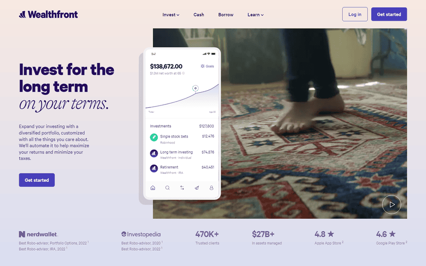
Wealthfront achieves a clutter-free, graphics-rich design, seamlessly presenting a wealth of information on the homepage. The lending process is made easily understandable through thoughtful typography.
21. Flywire: Clearly Communicating Financial Services
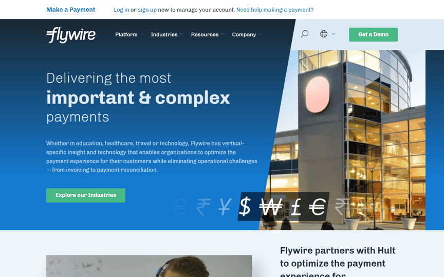
Flywire’s website provides a clear representation of the industry, business, and financial services it offers. Properly separated sections enhance user experience, while the digital publishing platform keeps users informed about the latest fintech news in the global economy and capital markets.
22. GiftSoft: Clean, Contemporary, and Persuasive
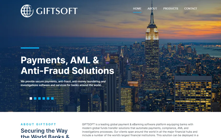
GiftSoft’s website stands out with a clean, contemporary, and persuasive design. A no-fuss, distraction-free approach emphasizes harmony between function and aesthetics, making it an ideal choice for those seeking websites that just work out of the box.
23. Western Union: Bright Colors and Powerful Contrast
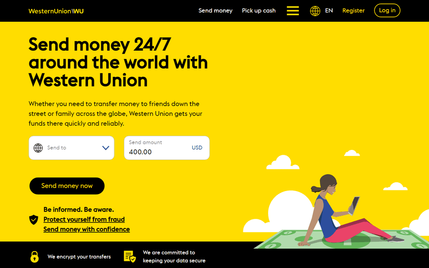
Western Union’s website employs bright and powerful contrasting colors, with yellow and black making a big impact. The well-sized, easily readable texts and friendly design effectively communicate the business and financial services offered by this renowned financial brand in mobile banking.
24. Acorns: Fresh and Friendly Green Design
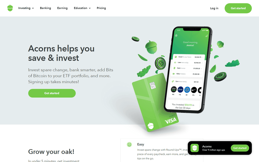
Acorns embraces the green color palette, creating a fresh and friendly feel. The website’s subtle animations breathe life into the banking niche, offering a visually appealing and user-friendly experience.
25. Morty: Simple, Beautiful, and Calm
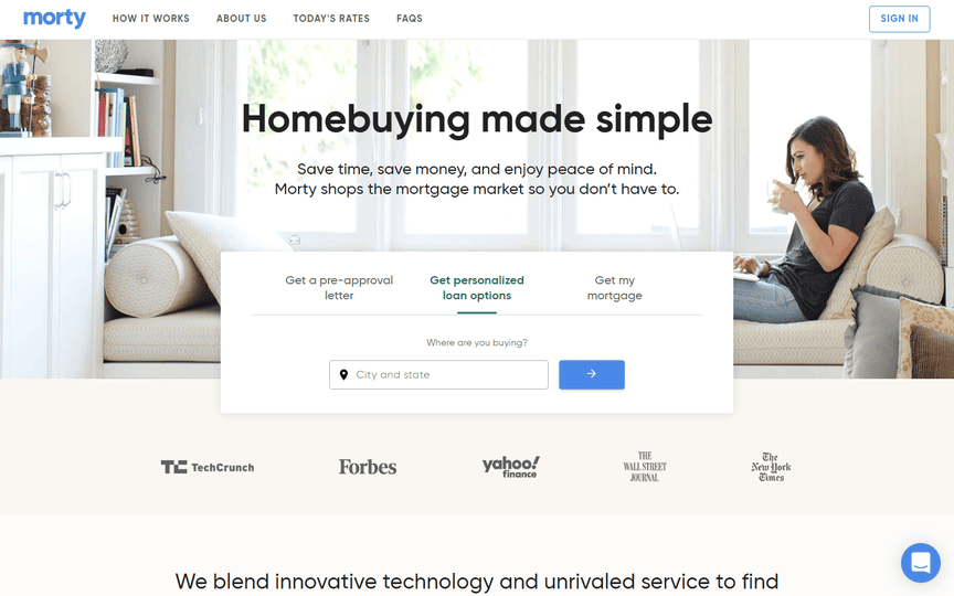
Morty’s banking website stands out for its simplicity, beauty, and calming user experience. The site provides a seamless journey, ensuring a calm, smooth, and easy experience for users of all levels.
26. TurboTax: Exciting Whitespace in Taxation
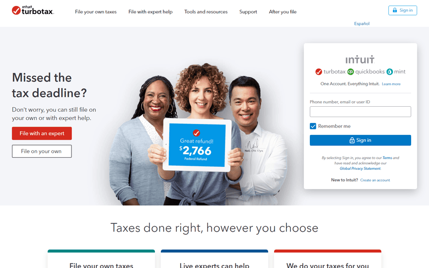
TurboTax’s popular website matches the quality of the financial services it provides. The generous use of whitespace from page to page transforms the typically daunting topic of taxes into an exciting experience.
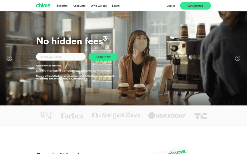
27. Chime: Modern Design with Effective Sliders
Chime’s website embraces sliders, a feature not as common in modern websites, and executes it seamlessly. The overall theme effectively conveys the company’s message and the financial services it offers in a smooth fashion.
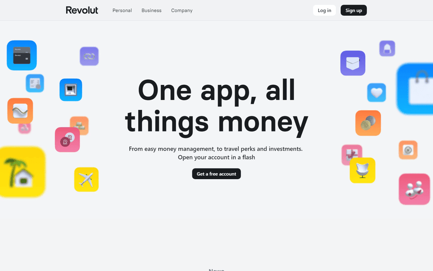
28. Revolut: Organized Layout with Modern Sleekness
Revolut’s website, while reminiscent of iOS devices, boasts an organized layout. Beautiful colors contribute to the site’s modern and sleek feel, creating an overall impression of efficiency.
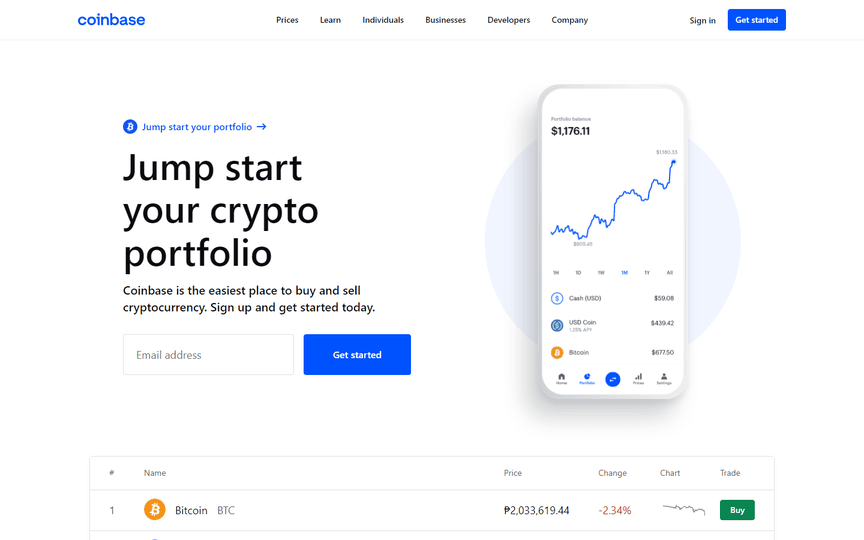
29. Coinbase: Clean, Impactful, and Informative
Coinbase impresses with its super clean yet impactful design. Live stats showing the latest developments in cryptocurrency are readily visible above the fold. Clean navigation enhances user experience, making information easily accessible.
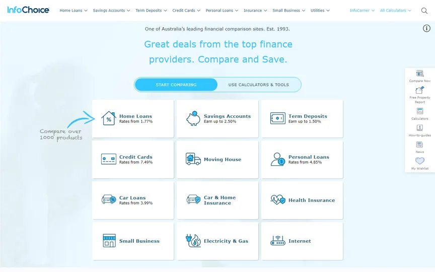
30. InfoChoice: Elevating Calculators in Style
InfoChoice takes calculators, often overlooked for their simplicity, and presents them in the most appealing way. The website’s sections are meticulously planned and executed, ensuring user-friendliness for visitors of all ages.
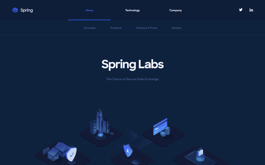
31. Spring Labs: Monochromatic Excellence
Spring Labs adopts a monochromatic website design that speaks volumes about the company’s competence. Each scroll brings a distinct delight to the user experience, with custom-made graphics adding an extra layer of originality.
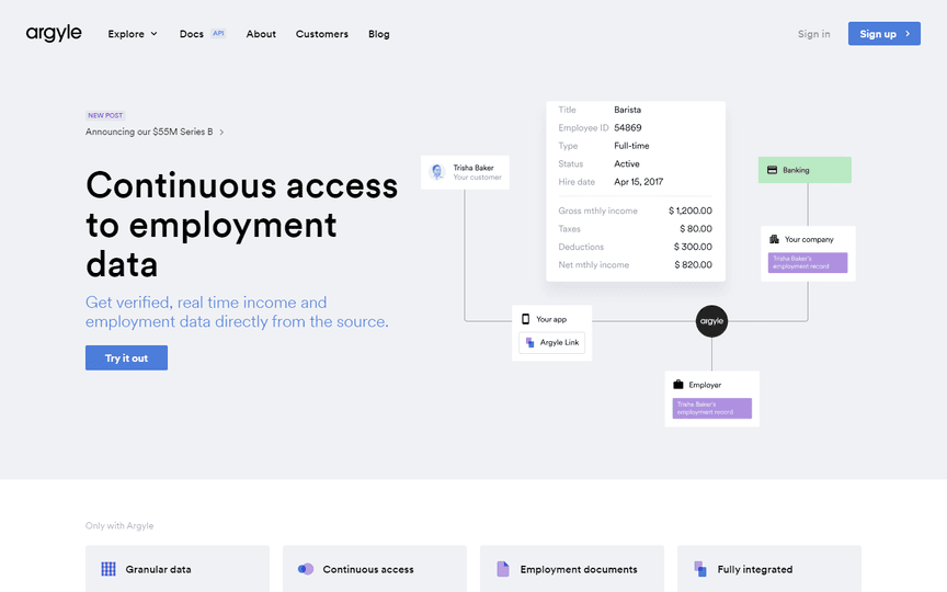
32. Argyle: Subtle Animations and Intuitive Layout
Argyle features subtle yet effective animations, delivering just the right amount of message about the financial services offered. The intuitiveness of the website as a whole enhances the user experience.
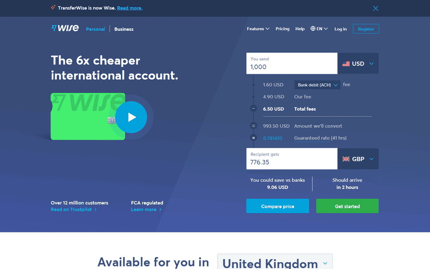
33. Wise: Transparency and Subtle Animations
Wise excels in transparency, declaring details upfront for transfers through its financial services. The website design ticks numerous boxes, with added subtle animations bringing the site to life.
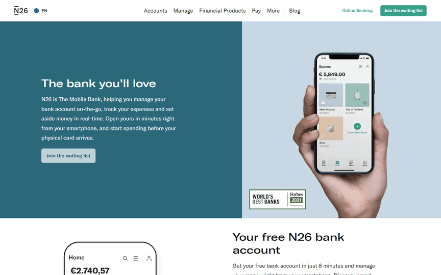
34. N26: Top-Notch Execution of Boxy Elements
N26, another product from Intuit, boasts a website with a nice and functional layout. Despite the presence of boxy elements, the execution is top-notch, ensuring a seamless user experience.
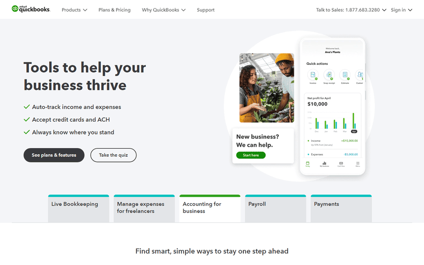
35. QuickBooks: Aesthetic Layout and Functionality
QuickBooks, another offering from Intuit, features a website that looks nice, feels nice, and works exceptionally well. The layout may contain boxy elements, but the execution is top-notch in terms of aesthetics and functionality.
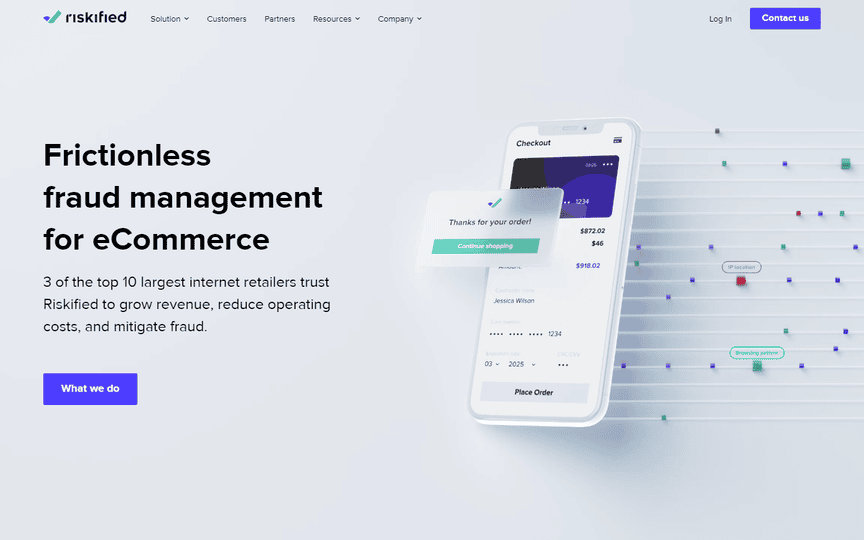
36. Riskified: Modern Animations and Organized Layout
Riskified presents a great-looking fintech website with modern animations. The organized layout effectively explains each idea in the financial sector in a satisfying way. The digital publication offers in-depth analyses of recent developments in e-commerce.
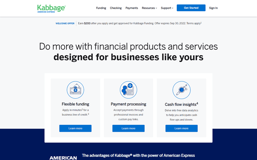
37. Kabbage: Short, Compact, and Surprisingly Fun
Kabbage’s banking website is short and compact but surprisingly fun. The website exemplifies that less complication can mean more, making it stand out in the competitive landscape of fintech companies on the web.
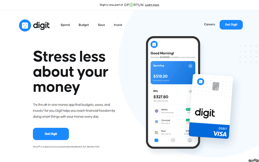
38. Digit: Big Bold Texts and Subtle Animations
Digit impresses with big, bold texts that make a statement and subtle animations on each scroll. The sticky navigation with a strong call-to-action button further enhances the user experience.
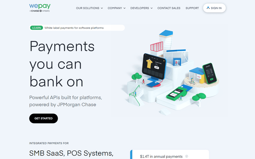
39. WePay: Custom 3D Graphics for Originality
WePay stands out with custom 3D graphics that make the website unique and original. Each scroll on every page feels distinct, beautiful, and harmonious in function and aesthetics.
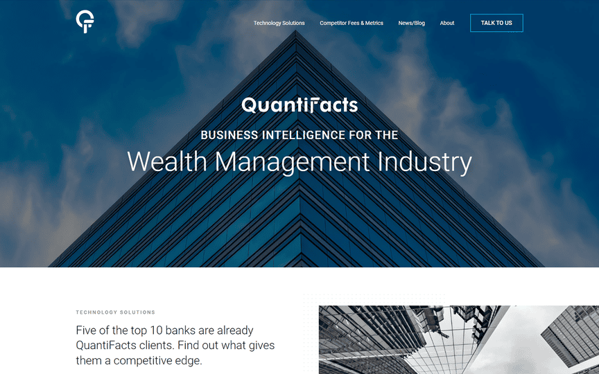
40. Quantifacts, Inc.:
Quantifacts, Inc. boasts a well-structured and easy-to-navigate website, simplifying the process of finding information. The homepage provides immediate access to the most up-to-date information, ensuring a positive user experience.
Fintech Website Design Trends
Minimalist Layouts:
Simplicity speaks volumes. Uncover the allure of minimalist layouts in fintech website design. From clean lines to uncluttered interfaces, minimalist designs convey sophistication and clarity, creating a positive user experience.
Interactive Infographics:
Visual storytelling takes center stage with interactive infographics. Explore how fintech websites leverage dynamic data representation to engage users and simplify complex financial concepts. Unearth the power of infographics in conveying information effectively.
Bold Illustrations:
Creativity meets functionality with bold illustrations. Delve into the world of vibrant visuals that not only capture attention but also communicate brand personality. Discover how bold illustrations contribute to a memorable and distinctive fintech brand.
Let Guerrilla Local Design Your Fintech Website
If you’re seeking a Web Design Company that understands the intricacies of showcasing Fintech Services, Guerrilla Local is your answer. Our dedicated web design and development team delves into your company’s vision and services, crafting a custom design that reflects your uniqueness. Engage visitors with a site that goes beyond aesthetics – Contact Us to discuss how we can elevate your online presence.
Conclusion
The world of fintech website design is a captivating blend of innovation, functionality, and creativity. As fintech companies continue to redefine the financial landscape, their website designs serve as a testament to their commitment to excellence.
Explore, be inspired, and let the best fintech website designs guide your journey towards shaping the future of finance.
FAQs
What considerations are crucial for fintech website design?
Fintech website design should prioritize modernity, user-friendliness, and responsiveness. These elements ensure a seamless user experience, crucial for engaging consumers.
How do minimalist layouts contribute to a positive user experience?
Minimalist layouts simplify navigation and reduce cognitive load, providing users with a clean and focused interface. This enhances usability and ensures a positive overall experience.
Why is mobile-friendliness essential for fintech websites?
Given the on-the-go nature of fintech services, mobile-friendliness ensures accessibility and convenience. Responsive designs adapt to various devices, catering to a diverse user base.
Can bold illustrations convey a brand’s identity in fintech?
Absolutely. Bold illustrations not only capture attention but also communicate the brand’s personality and values. They contribute to brand recognition and memorability.
What role do interactive infographics play in fintech website design?
Interactive infographics simplify complex financial concepts, making information more digestible for users. They engage visitors and contribute to a visually compelling website.
How often should fintech companies update their website designs?
Regular updates are essential to stay relevant in the ever-evolving fintech landscape. Aim for a balance between innovation and consistency to maintain a modern and appealing website.


