Are you tired of scouring the internet for the best websites, only to find disappointingly bad ones? Well, you’re in for a treat!
In this article, we’re unveiling the top bad websites on the web, focusing not on their lack of content or functionality, but on their horrendous designs.
If you’re a website designer or simply someone who appreciates good design, you might want to cover your eyes for what’s coming next.
Table of Contents
What Makes a Website “Bad”?
In the vast expanse of the internet, not all websites are created equal. Some stand as shining examples of design brilliance, while others languish in the depths of mediocrity. So, what makes a website truly “bad”? Let’s dissect the characteristics that contribute to a website’s unfortunate descent into the realm of poor design.
Outdated Layouts:
One of the telltale signs of a bad website is an outdated layout. In the ever-evolving digital landscape, clinging to an antiquated design screams neglect. Users expect a seamless and visually appealing experience, and an outdated layout can be a major turn-off.
Cluttered Interfaces:
We’ve all encountered websites that seem to have embraced chaos. A cluttered interface overwhelms visitors, making it challenging to find relevant information. From an excess of pop-ups to a mishmash of colors and fonts, a cluttered interface is a surefire way to repel users.
Confusing Navigation:
Navigation is the backbone of user experience. When a website’s navigation resembles a labyrinth, users are likely to abandon ship. Illogical menu structures, broken links, and a lack of clear pathways contribute to a frustrating user experience.
Poor Color Choices:
Colors evoke emotions and set the tone for a website. Poor color choices can create a jarring and unprofessional impression. Whether it’s an overwhelming color palette or clashing hues, a lack of color harmony can repel visitors.
Slow Loading Times:
In the fast-paced digital age, users demand speed. A website that takes eons to load is a recipe for disaster. Slow loading times frustrate visitors, leading to high bounce rates and a tarnished reputation.
The List of 45 Bad Websites
1. Craigslist:
Craigslist, a digital marketplace giant, falls victim to its overt simplicity. While simplicity can be a virtue, Craigslist’s design leaves users questioning its intentional minimalism. Dive into the abyss of classifieds, and you’ll find an interface that lacks the finesse expected from a platform of such prominence.

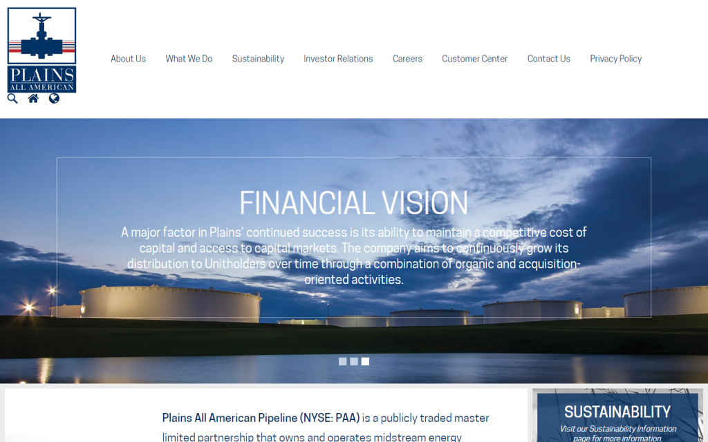
2. Berkshire Hathaway Inc.:
Berkshire Hathaway, a multinational holding company, surprises visitors with a website that feels more like a startup than a corporate powerhouse. The clean and light design, while aesthetically pleasing, misses the mark for conveying the gravitas one expects from a conglomerate of this stature.
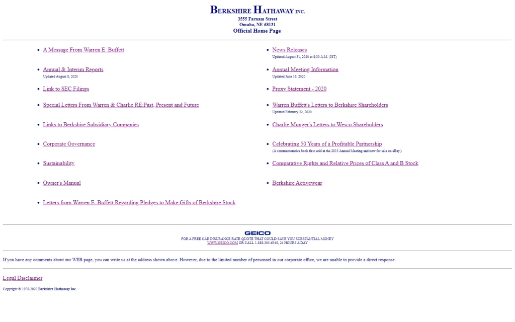
https://berkshirehathaway.com/
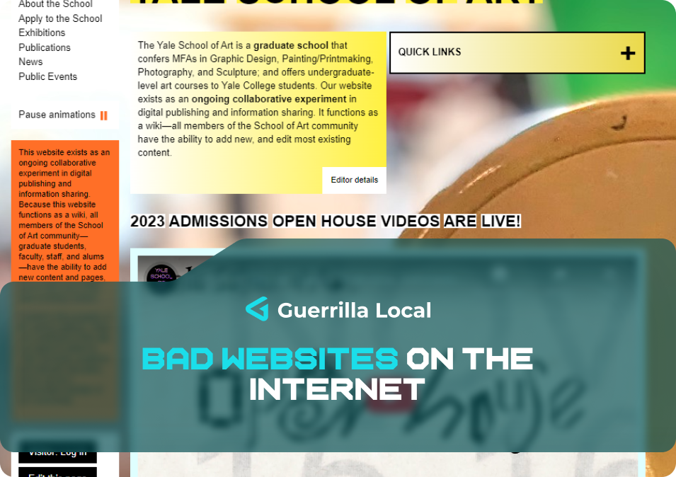
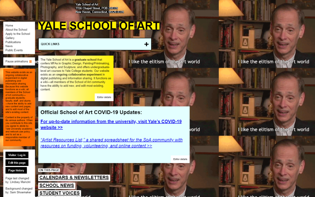
3. Yale School of Art:
Navigating the Yale School of Art’s website is akin to stepping into a time warp. The outdated, distracting design, coupled with an Elitism GIF background, creates an atmosphere that contradicts the institution’s commitment to artistic excellence. It’s a visual conundrum that challenges the essence of user-friendly design.
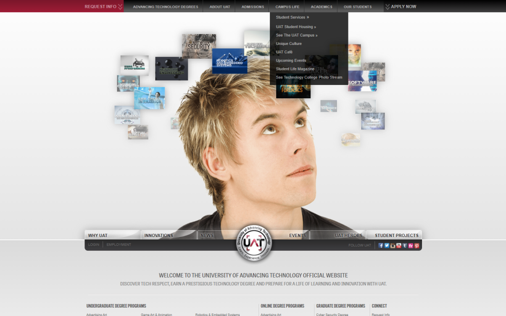
4. University of Advancing Technology:
The University of Advancing Technology fails to live up to its name in the digital realm. The website’s design feels like a relic from the past, with numerous elements vying for attention. In a world where cutting-edge technology is paramount, this site misses the mark, leaving visitors perplexed and unimpressed.
5. Suzanne Collins:
Fans of the Hunger Games trilogy may find themselves disappointed when visiting Suzanne Collins’ website. A beloved author deserves a captivating digital presence, yet this site is trapped in the past. Unclear images and an overall lackluster design do a disservice to the literary legacy of Suzanne Collins.
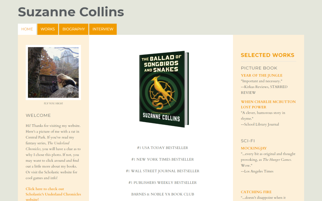
http://www.suzannecollinsbooks.com/
6. Budgets Are Sexy:
Despite earning recognition from prestigious firms like The New York Times and Forbes, Budgets Are Sexy finds itself teetering on the edge of digital mediocrity. The website’s design feels cramped, busy, and monotonous, failing to align with the financial wisdom it aims to impart.
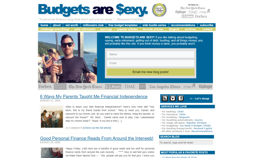
https://www.budgetsaresexy.com/
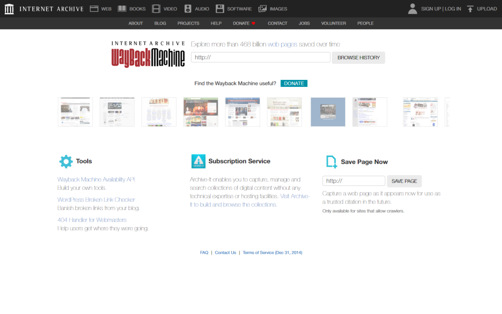
7. Internet Archive Wayback Machine:
The Internet Archive Wayback Machine, a digital preservation powerhouse, ironically suffers from a backward design. Serving millions daily, its header inundated with links creates a cumbersome user experience. A website with a strong purpose requires a design that propels it forward, not one that anchors it to the past.
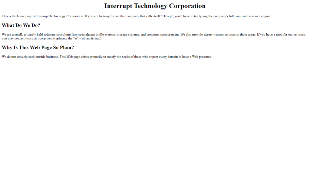
8. Interrupt Tech Corp.:
Interrupt Tech Corp., despite boasting a good domain name, misses the mark in design. The website’s existence seems arbitrary, lacking a clear purpose beyond mere online presence. The attempt at humor in explaining its design choices only adds to the confusion.
9. The One and Only Sparkella:
Channing Tatum’s picture book, Sparkella, weaves a dreamy narrative with its stunning cover but falters when it comes to the digital counterpart. The website lacks the same attention to detail, leaving visitors with a jarring contrast between the enchanting book cover and the lackluster online experience.
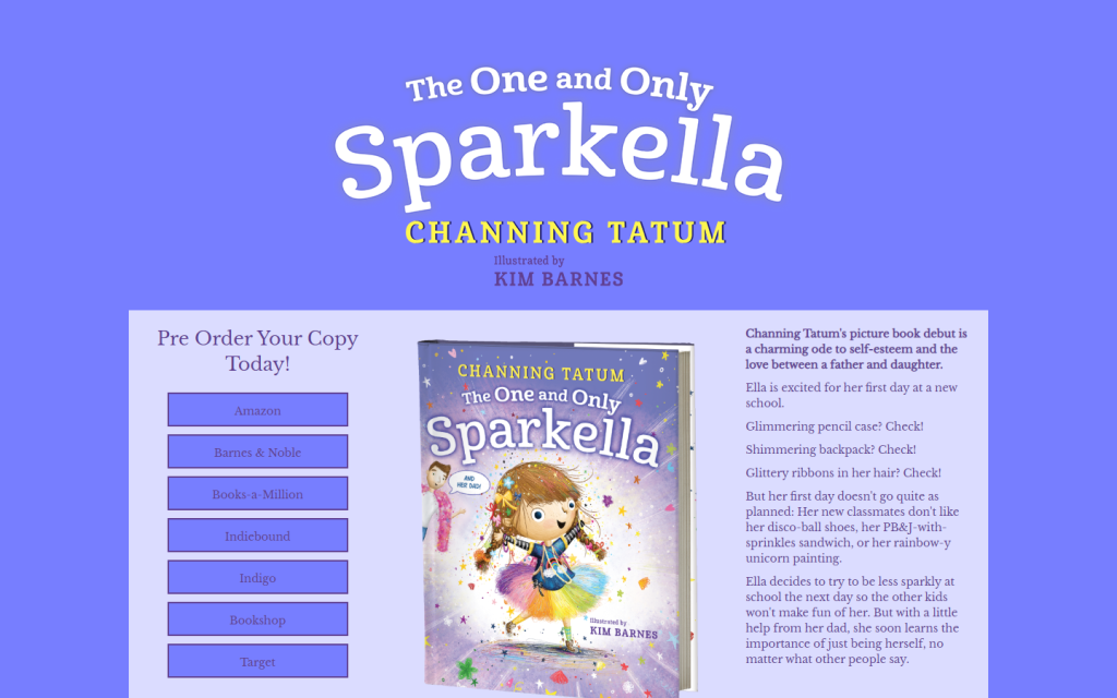
https://read.macmillan.com/mcpg/the-one-and-only-sparkella/
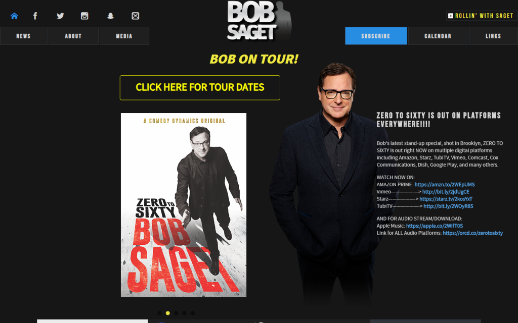
10. Bob Saget:
Bob Saget’s website, while housing all the necessary information, succumbs to navigational chaos. Unclear headings, off-grid elements, and a lack of text contrast create a distracting user experience. A website that strives to deliver information must prioritize clarity in its structure.
11. Dollar Tree:
Well-known for party supplies, Dollar Tree’s website overwhelms users with excessive text. The green color scheme, intended for a refreshing feel, ironically induces stress. The challenge lies in striking a balance between showcasing products and maintaining a user-friendly design.

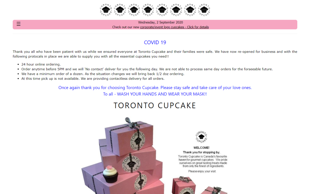
12. Toronto Cupcake:
Toronto Cupcake’s website, adorned with repeated logos, struggles with unclear headings and a risky layout. Navigating the site becomes an exercise in patience, emphasizing the need for a user-centric redesign. A website should sweeten the user experience, not leave a bitter taste.
13. Agents of America:
Agents of America’s website shrouds itself in ambiguity. Lacking clarity on the agency it discusses and its offerings, the site feels more like a blog with an unclear niche. For a website to thrive, it must clearly communicate its purpose and value proposition.
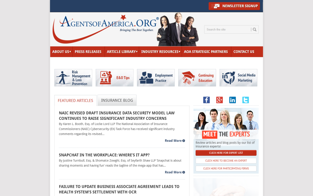
http://www.agentsofamerica.org/
14. Illuminati Exposers:
As the name suggests, Illuminati Exposers falls short with outdated design and excessively bright colors. The website’s visual elements fail to resonate with modern users, detracting from its intended message. A strategic design overhaul is imperative to align with contemporary aesthetics.

https://nwokillers.weebly.com/
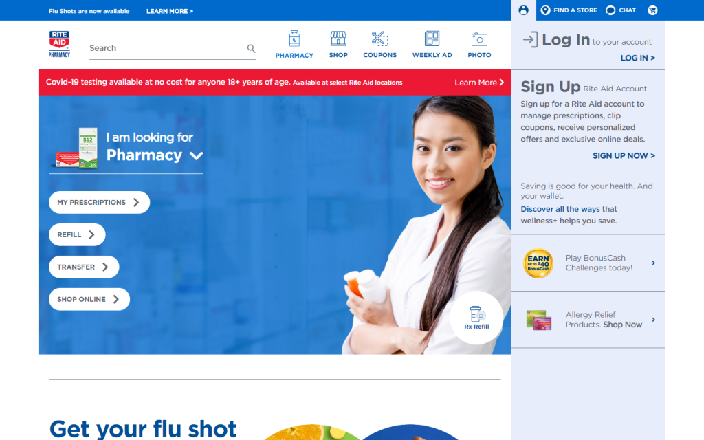
15. Rite Aid Pharmacy:
While functional and catchy, Rite Aid Pharmacy’s website leaves negative spaces that feel more like voids. The call for more valuable content on the homepage highlights the need to enrich the user experience. A pharmacy website should not just function but educate and engage its audience.
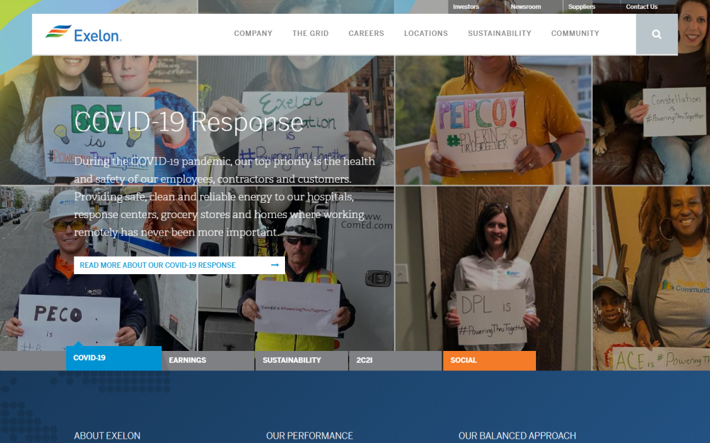
16. Exelon:
Even Fortune 500 companies are not immune to the pitfalls of a Bad Website. Exelon’s online presence falters with intolerable contrast on various elements and unnecessary negative spaces. For a company of such stature, the website’s design falls short of the expected standard.
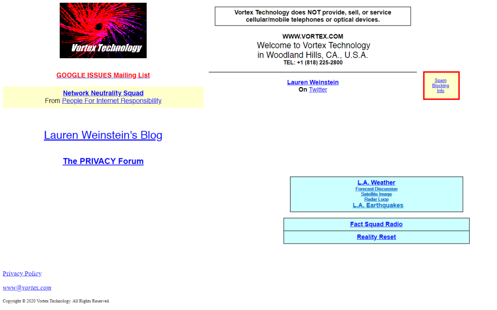
17. Vortex Technology:
If you’ve lived through the ’80s to ’90s and experienced dial-up networking, Vortex Technology’s website might feel like a blast from the past—a Bad Website that unintentionally stumbles upon outdated design choices.
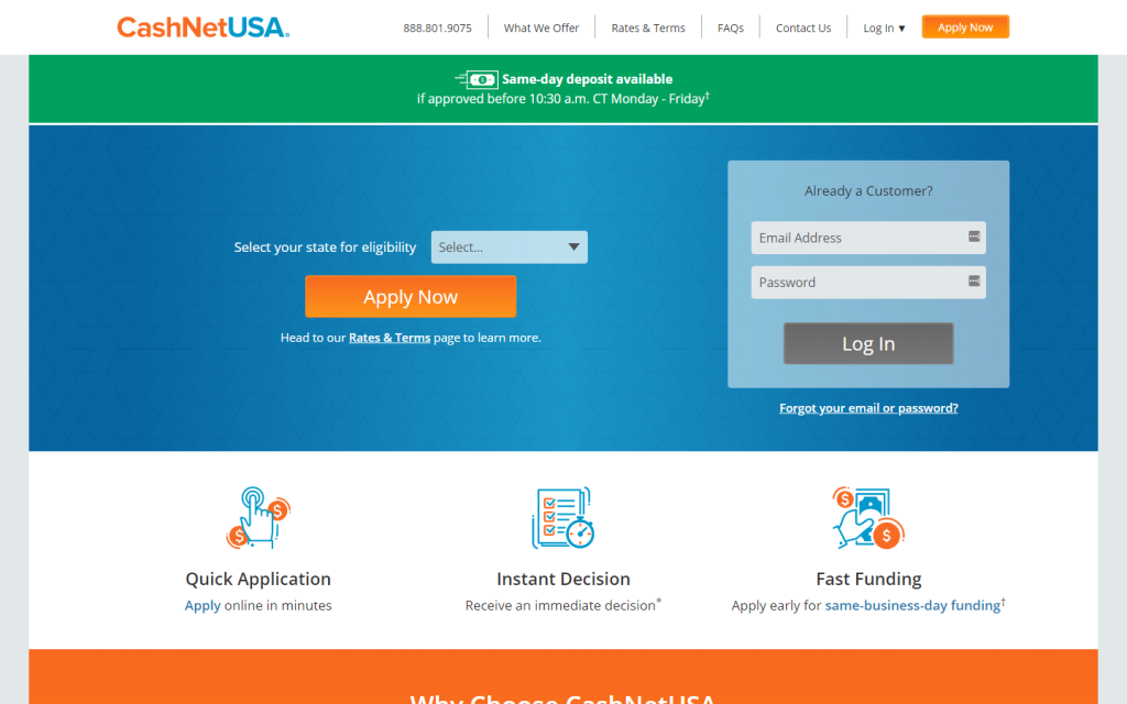
18. CashNetUSA:
Colors alone cannot salvage the reputation and impact of CashNetUSA’s website, earning it the title of a Bad Website. The lack of images and a bland hero area contribute to a digital experience that fails to captivate.
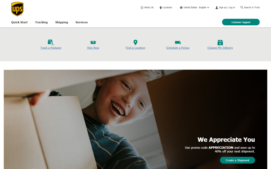
19. UPS:
In the realm of logistics, UPS’s website stands as a testament to the fact that even giants can succumb to being a Bad Website. The design is basic and underwhelming, lacking the innovation one would expect from a global logistics powerhouse.
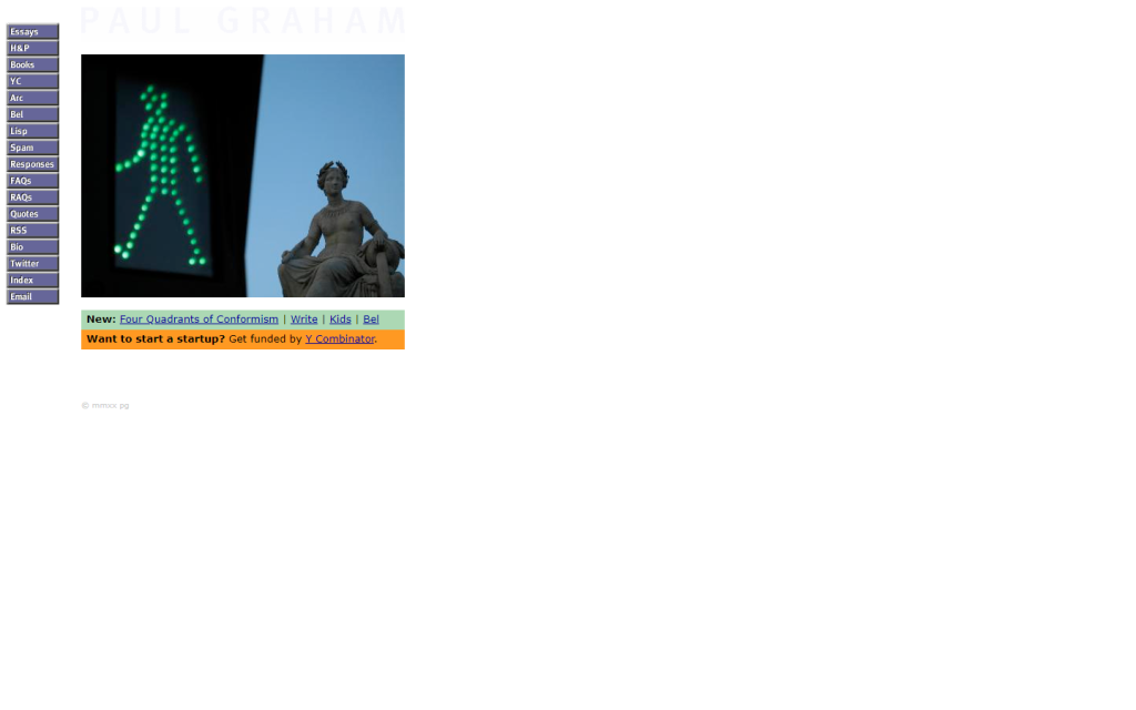
20. Paul Graham:
Despite the recognition of the title ‘Paul Graham,’ the website’s small stature and unclear design render it a Bad Website. Navigating the site leaves users puzzled, underscoring the importance of a clear and impactful web presence.
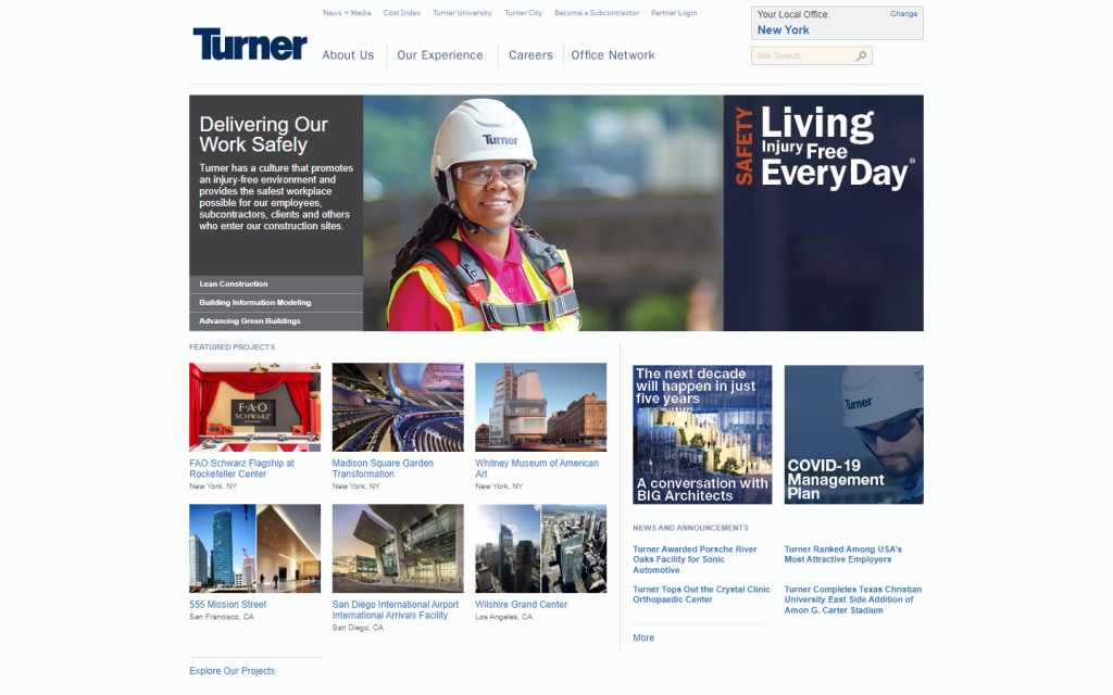
21. Turner Construction Company:
Despite their authority in the construction industry, Turner Construction Company’s website appears outdated. Small images showcasing their work fail to make the impact they deserve, marking it as a Bad Website in need of a modern overhaul.
https://www.turnerconstruction.com/
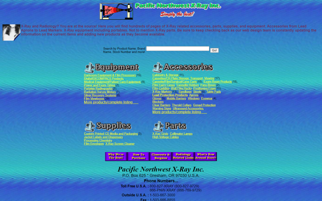
22. Pacific Northwest X-Ray Inc.:
Incorrect color usage, a dated clip-art animated logo, and a cluttered layout make Pacific Northwest X-Ray Inc.’s website a prime example of a Bad Website. Critical contact details buried below demand immediate attention for a redesign.
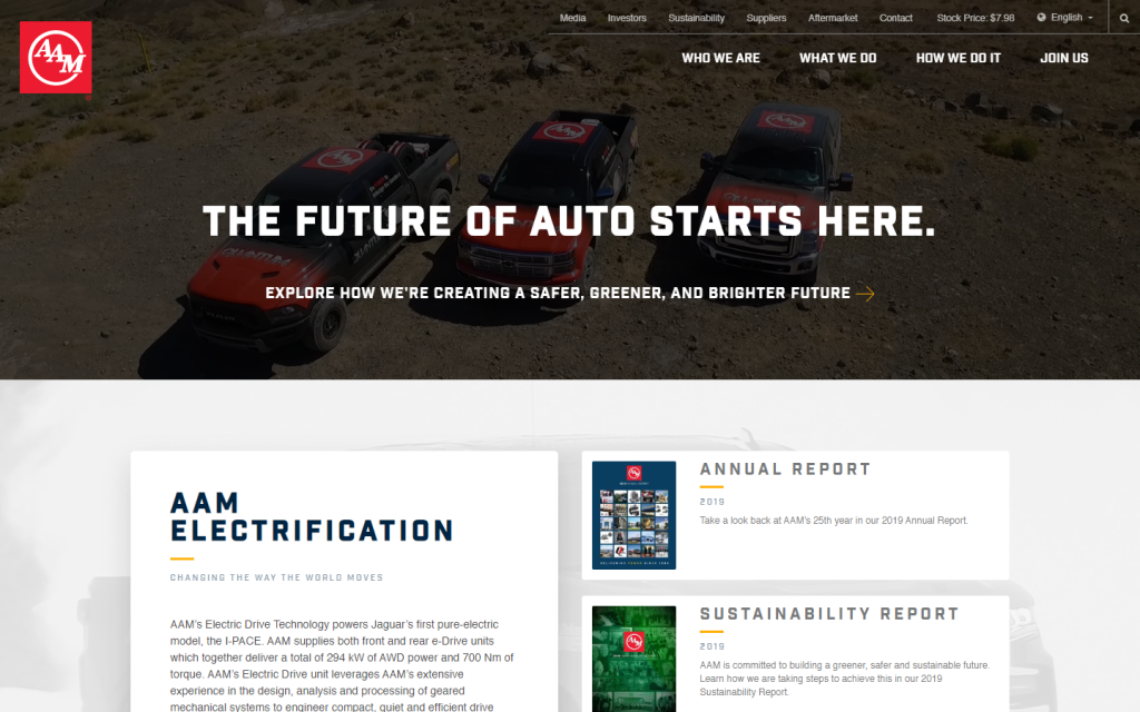
23. American Axle & Manufacturing:
While the hero section exudes modernity, the rest of American Axle & Manufacturing’s website lacks value and impact, dotted with unnecessary white spaces. A Bad Website that needs strategic content placement and a more engaging layout.
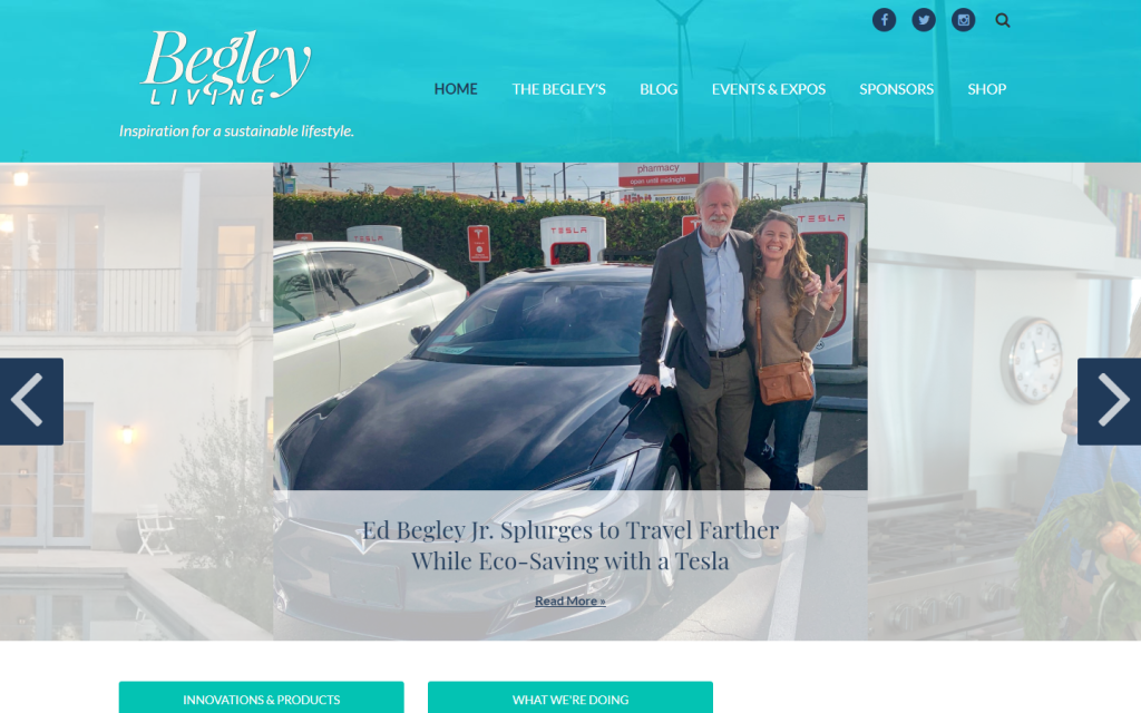
24. Begley Living:
Known for American actor Ed Begley Jr., Begley Living’s website feels like a rushed investment without proper consideration for good web design. The lack of a solid layout places it firmly in the realm of a Bad Website.
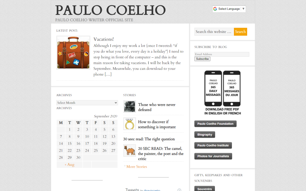
25. Paulo Coelho:
Even a renowned author like Paulo Coelho isn’t immune to the struggles of a Bad Website. The official website feels like a standard WordPress blog template, lacking the bespoke touch expected from a literary icon.
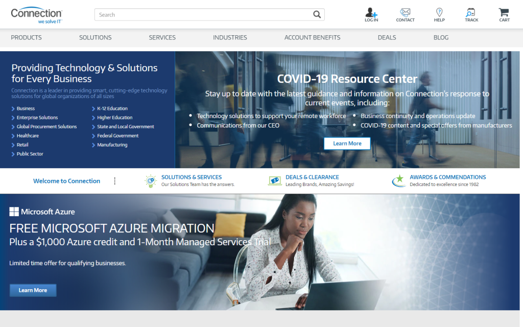
26. Connection:
Connection’s website is in dire need of breathing room—a Bad Website where copy is crammed at the top, suffocating the user experience. A strategic reorganization is essential to transform it into a well-structured and user-friendly platform.
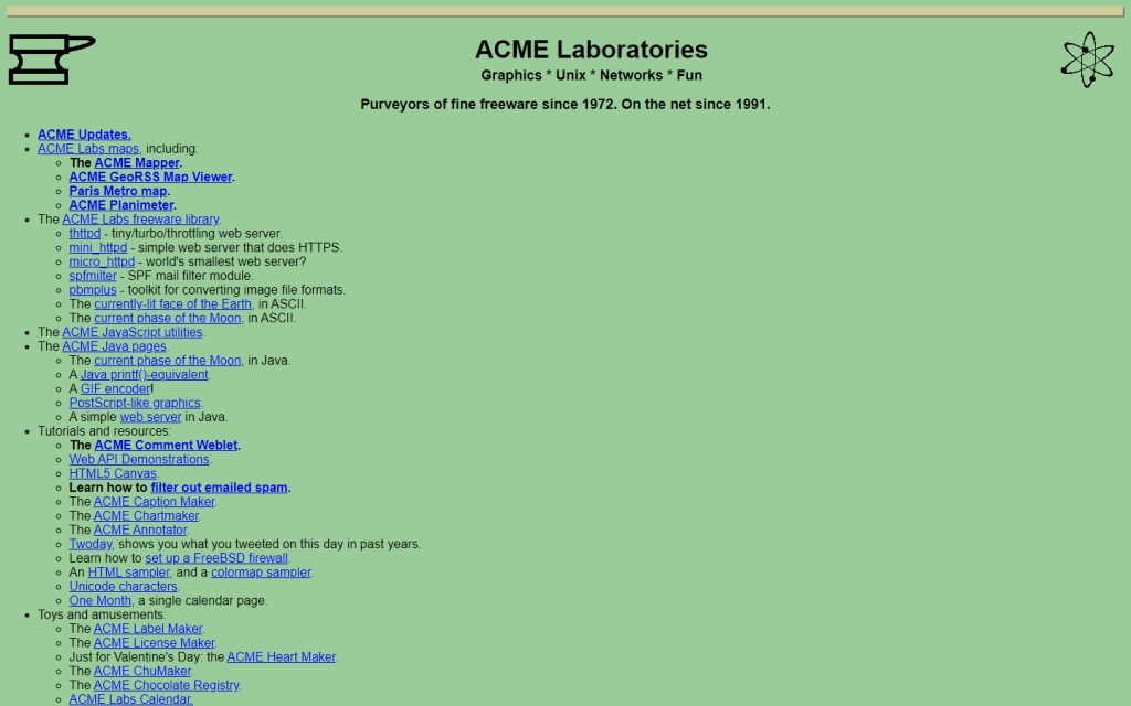
27. ACME Laboratories:
ACME Laboratories presents an intriguing snapshot of the internet’s evolution. While commendable for its informative content and rich links, the design seems reminiscent of a bygone era, creating a slight mismatch with its contemporary niche.
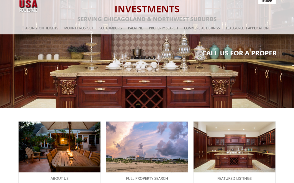
28. USA Real Estate:
In the vast realm of real estate, the USA Real Estate website grapples with readability issues and peculiar design choices. The cut-off texts and the marquee rolling effect on the hero section contribute to an experience that falls short of user-friendly standards.
29. Maverick Industries:
Maverick Industries hints at a need for a digital facelift. Beyond its cry for an update, the background keyword tactic raises eyebrows as a questionable strategy for enhancing online visibility.

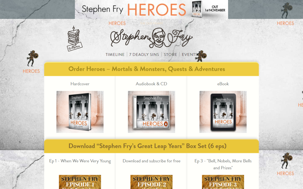
30. Stephen Fry Heroes:
Even the online domain of a celebrated personality like Stephen Fry has its quirks. The website, with its distracting elements, unclear structure, and a somewhat disjointed color scheme, seems to lack the cohesiveness expected of a digital presence.
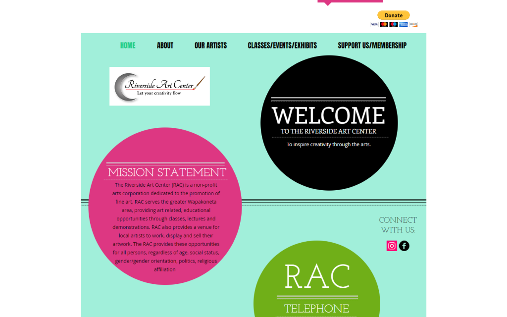
31. Riverside Art Center:
Riverside Art Center’s online canvas paints a confusing picture. The absence of upfront images, a seemingly misplaced logo, and hard-to-read texts contribute to an experience that leaves visitors searching for clarity.
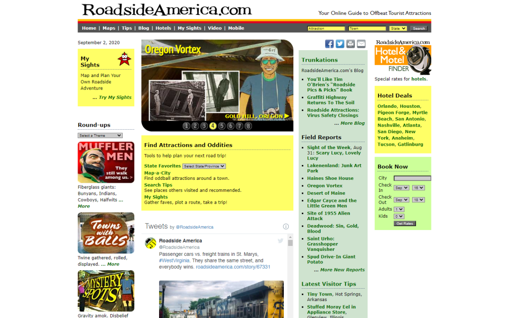
32. Roadside America:
Navigating the online roads of Roadside America can be likened to a journey without clear signposts. The website’s unclear niche and a layout that lacks straightforward navigation make it challenging for users to find what they’re looking for.
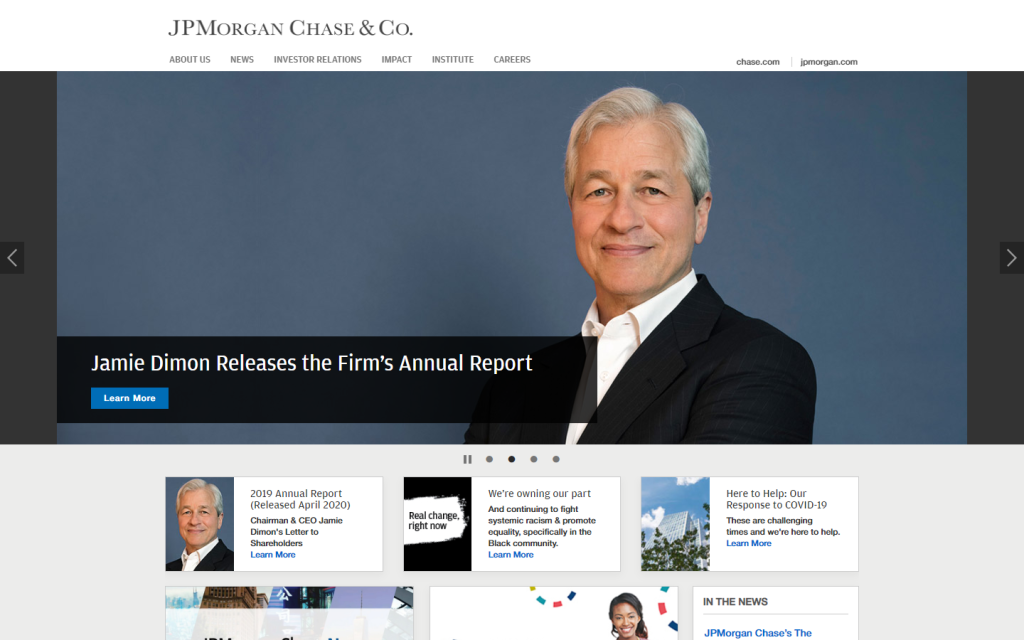
33. JPMorgan Chase&Co.:
Even financial juggernauts can encounter digital pitfalls. JPMorgan Chase&Co.’s online presence, with its lack of stylistic elements, presents a straightforward but somewhat uninspiring interface—a departure from the level of sophistication expected.
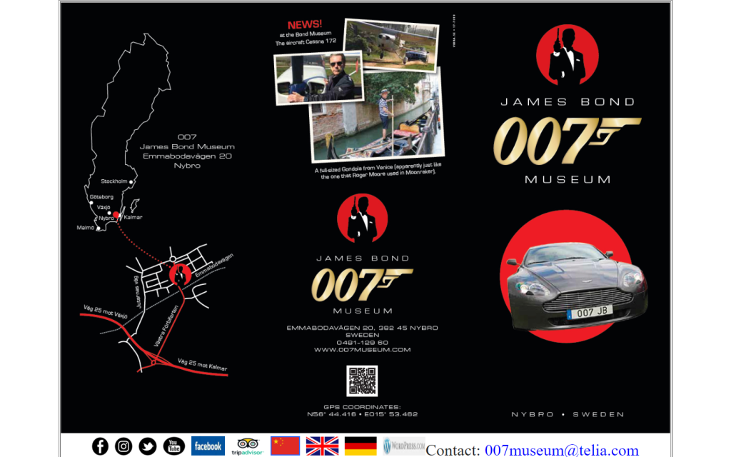
34. James Bond 007 Museum:
The digital sanctuary of James Bond grapples with an enigma of design challenges. An unclear structure, collages of crammed images, and navigation woes make this website a puzzling experience for visitors.
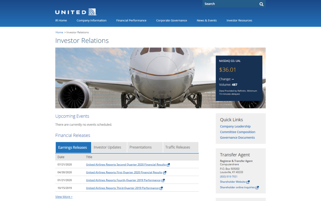
35. United Airlines – Investor Relations:
In the realm of investor relations, United Airlines’ simple design can be a double-edged sword. Some visitors may mistake it for an old wiki site, highlighting the importance of achieving a balance between simplicity and sophistication.
36. Pacific Northweast X-Ray Inc.
Pacific Northweast X-Ray Inc. earns its spot as one of the lowest-quality websites. The lack of clarity about its purpose and outdated design make it an uninviting space, leaving visitors with little reason to explore further.

37. Blinkee
Blinkee’s desktop version offers a questionable user experience, and the mobile version doesn’t fare much better. The hero section lacks sophistication, and the branding and color choices defy conventional patterns. The live chat and menu are perhaps the only redeeming features.
38. Ling’s Cars
Ling’s Cars, despite its flashy appearance, bewilders visitors with its distracting elements and unresponsive layout, especially on mobile. The excessive use of animations and a video that gets lost amid the chaos contribute to a less-than-ideal user experience.
39. The Big Ugly Website
The Big Ugly Website lives up to its name, showcasing an example of a truly bad website. The color choices and lack of overall design are evident, making navigation a challenging experience. Even the clickable “f” icon in the corner adds to the confusion.
40. Arngren
Arngren’s website resembles an outdated yellow page, neglecting the fundamentals of a good user experience. The collage of images with tiny fonts, unresponsive design, and impractical navigation hinder any attempt to quickly skim through the content.
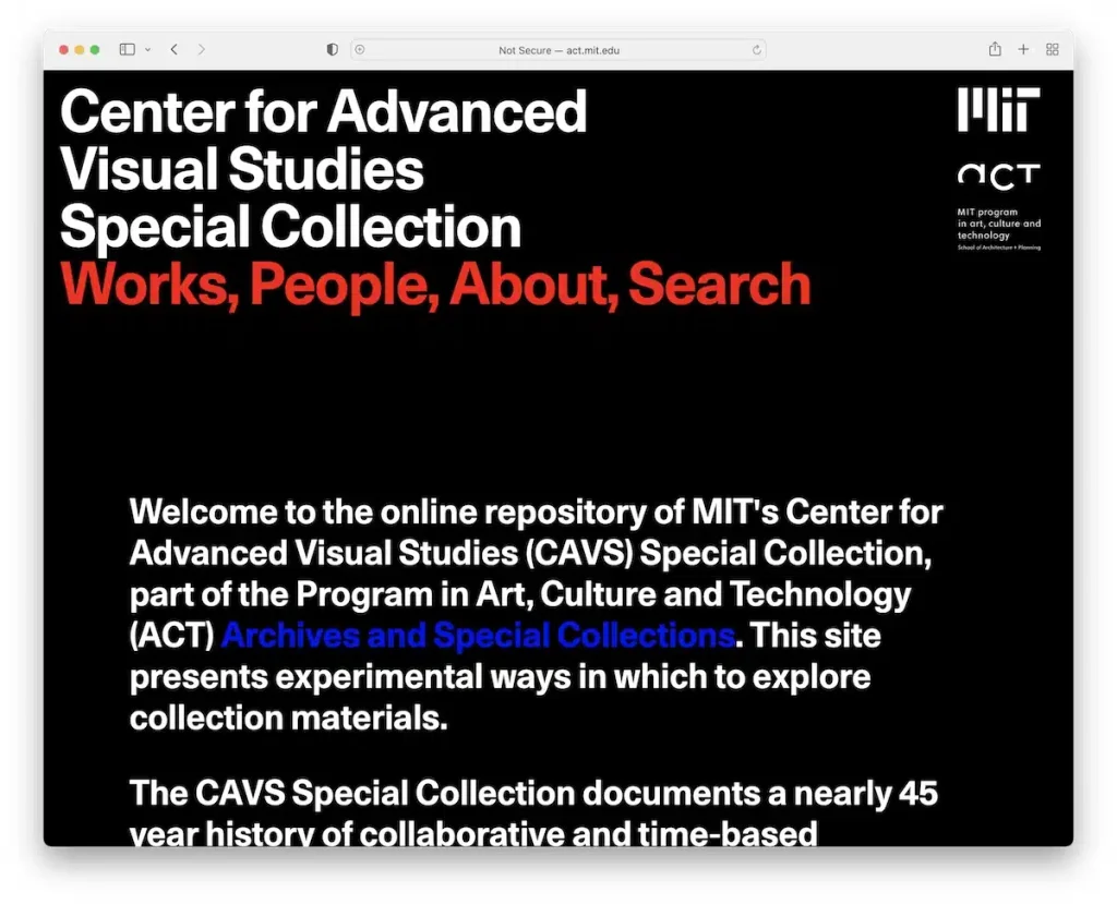
41. CAVS
CAVS misses the mark with its choice of animations, making text and images harder to read. The excessive length of the website may discourage users from scrolling further. Design flaws contribute to a less-than-ideal user experience.
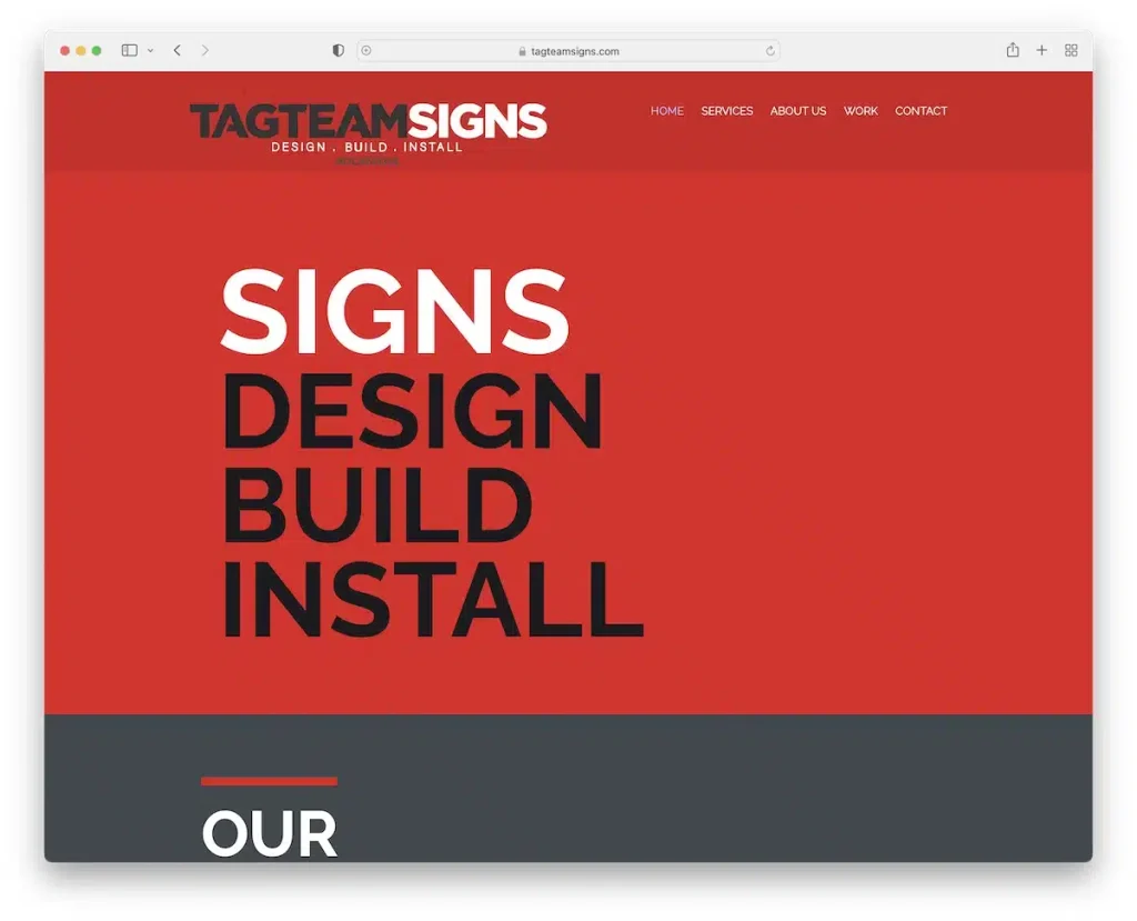
42. Tag Team Signs
Despite being in the business of designing signs, Tag Team Signs falls short in web design professionalism. The bold but poorly chosen colors, typography, and background images reflect a lack of cohesive design. The only saving grace is the “Get in touch” section.
43. The World’s Worst Website Ever
If the goal of The World’s Worst Website Ever is to exemplify poor web design, it succeeds remarkably. Flashy details, irrelevant white space, banner ads, and complete unresponsiveness create a user experience that defies modern design principles.

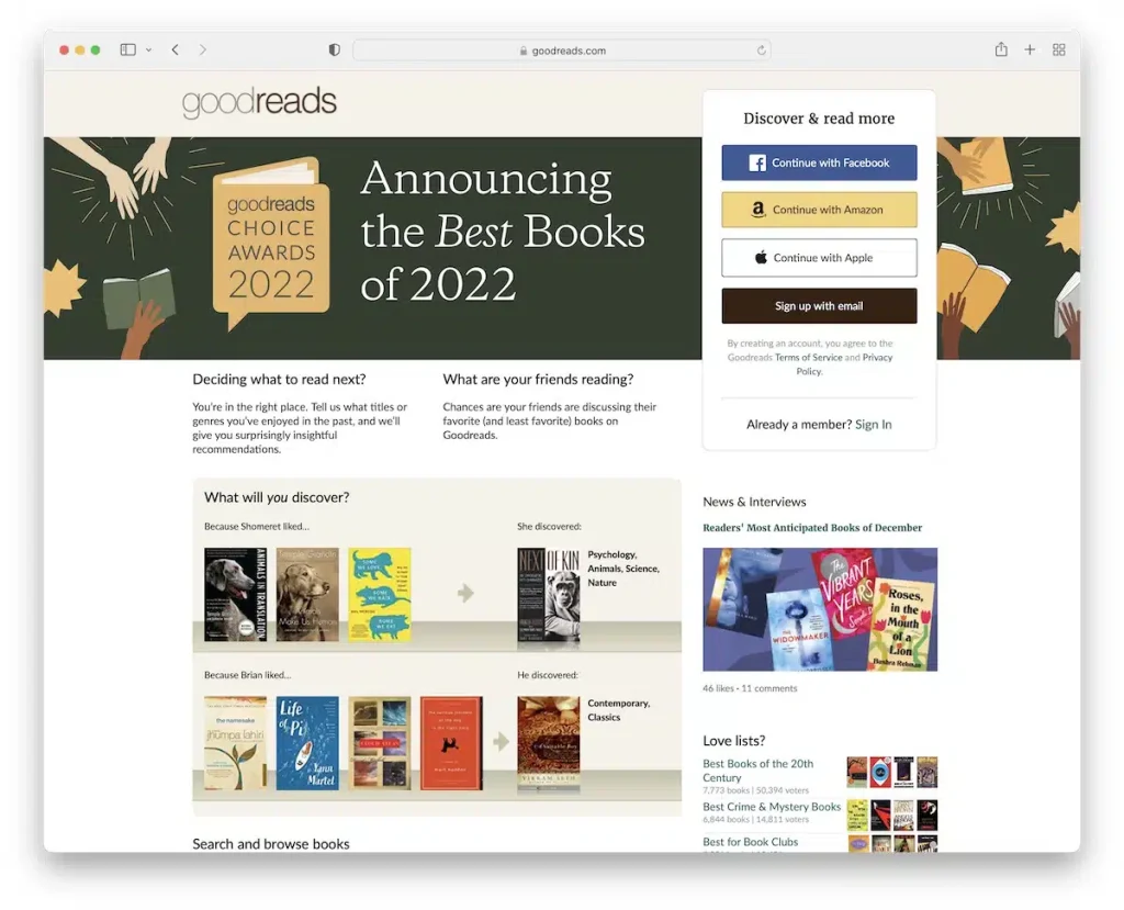
44. Goodreads
Surprisingly, even a giant like Goodreads finds itself on this list. While not the worst, its basic design and navigation issues on the desktop version fall short of expectations. The mobile layout offers a better experience, but downloading the app seems a more viable option.
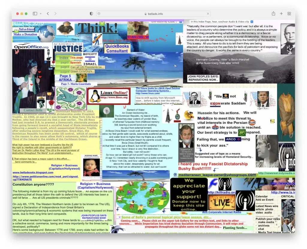
45. Bella De Soto
Bella De Soto’s website commits multiple design sins, from forcing auto-downloads to poor-quality animations and a cluttered layout. Responsiveness is a distant consideration, leaving visitors with a subpar user experience.
Common Design Mistakes
Now that we’ve identified the elements that make a website bad, let’s delve into the common design mistakes that plague the digital landscape. Recognizing these pitfalls is essential for steering clear of a design disaster.
Clashing Color Schemes:
Mismatched colors assault the senses and diminish the overall aesthetic appeal of a website. Designers must carefully choose a harmonious color palette that enhances the user experience.
Overwhelming Pop-Ups:
While pop-ups can be effective, an excess of intrusive pop-ups can drive users away. Striking a balance between engaging content and unobtrusive pop-ups is crucial.
Lack of Mobile Responsiveness:
In the era of smartphones, a failure to optimize for mobile devices is a cardinal sin. Websites that don’t adapt to various screen sizes alienate a significant portion of their audience.
Ignoring Accessibility:
A website that neglects accessibility considerations excludes users with disabilities. Designers must prioritize features like alt text, keyboard navigation, and other accessibility standards.
Unintuitive User Interface (UI):
An intuitive UI is the key to user satisfaction. Complex navigation, unclear calls-to-action, and non-intuitive layouts hinder the user experience and contribute to a bad website.
Impact of Bad Design on User Experience
Bad design is not a mere aesthetic flaw; it has tangible consequences on user experience. Let’s explore how a poorly designed website can leave a lasting impact on its visitors.
Increased Bounce Rates:
Users confronted with a poorly designed website are likely to hit the dreaded “back” button swiftly. High bounce rates signal dissatisfaction and adversely affect a site’s ranking on search engines.
Negative Brand Perception:
A website is often the first interaction a user has with a brand. A bad website creates a negative first impression, eroding trust and tarnishing the overall perception of the brand.
Decline in Conversions:
A convoluted and frustrating user experience translates to a decline in conversions. Whether it’s making a purchase, signing up, or engaging with content, users are less likely to take desired actions on a poorly designed website.
Increased Customer Support Queries:
Users confused by bad design are more likely to seek clarification through customer support channels. This not only strains support resources but also indicates a failure in providing a self-explanatory interface.
Damaged SEO Performance:
Search engines prioritize user experience. Websites with bad design receive signals of dissatisfaction from users, leading to a decline in search engine rankings and visibility.
How to Avoid Bad Website Design
Now that we’ve explored the pitfalls and consequences of bad design, let’s shift our focus to proactive measures. Designers, take note—here’s how to avoid the abyss of bad website design.
Embrace User-Centered Design:
Prioritize user needs and preferences in the design process. Conduct user testing, gather feedback, and iterate to create a website that resonates with your audience.
Keep It Simple:
Simplicity is the hallmark of effective design. Streamline your website’s layout, navigation, and content to provide a straightforward and enjoyable experience for users.
Prioritize Mobile Responsiveness:
In a mobile-centric world, ensure that your website is responsive across various devices. Optimize layouts, images, and content for seamless viewing on smartphones and tablets.
Test Loading Times:
Monitor and optimize your website’s loading times regularly. Compress images, leverage browser caching, and invest in reliable hosting to ensure swift page loads.
Stay Updated:
Keep abreast of design trends and technological advancements. Regularly update your website to incorporate fresh design elements and ensure compatibility with the latest browsers.
Let Guerrilla Local Design Your Dream Website
If you’re seeking a Web Design Company that understands the intricacies of showcasing services, Guerrilla Local is your answer. Our dedicated web development team delves into your company’s vision and services, crafting a custom design that reflects your uniqueness. Engage visitors with a site that goes beyond aesthetics – Contact Us to discuss how we can elevate your online presence.
Conclusion
In conclusion, the journey through the world of bad websites serves as a cautionary tale. By understanding the criteria for bad design, analyzing specific examples, exploring common mistakes, and acknowledging the impact on user experience, we equip ourselves to navigate the digital landscape more responsibly.
As website creators and users, let’s strive for excellence in design, ensuring a positive and engaging online experience for all.